Customize Data Charts
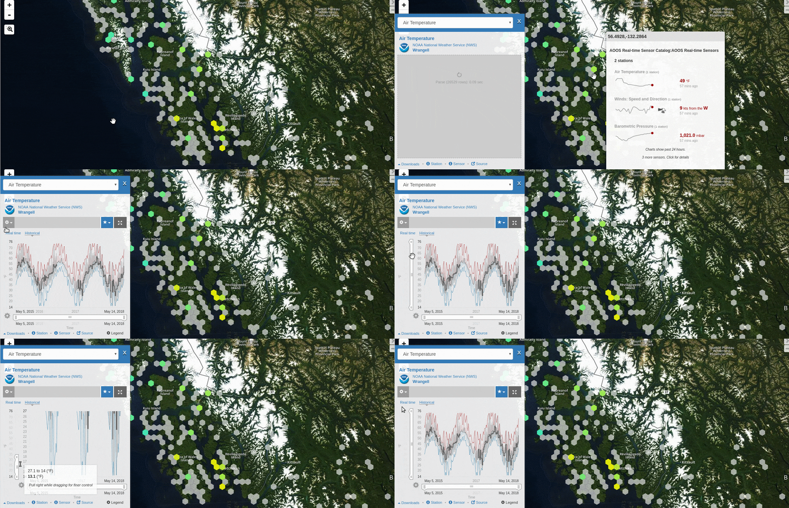
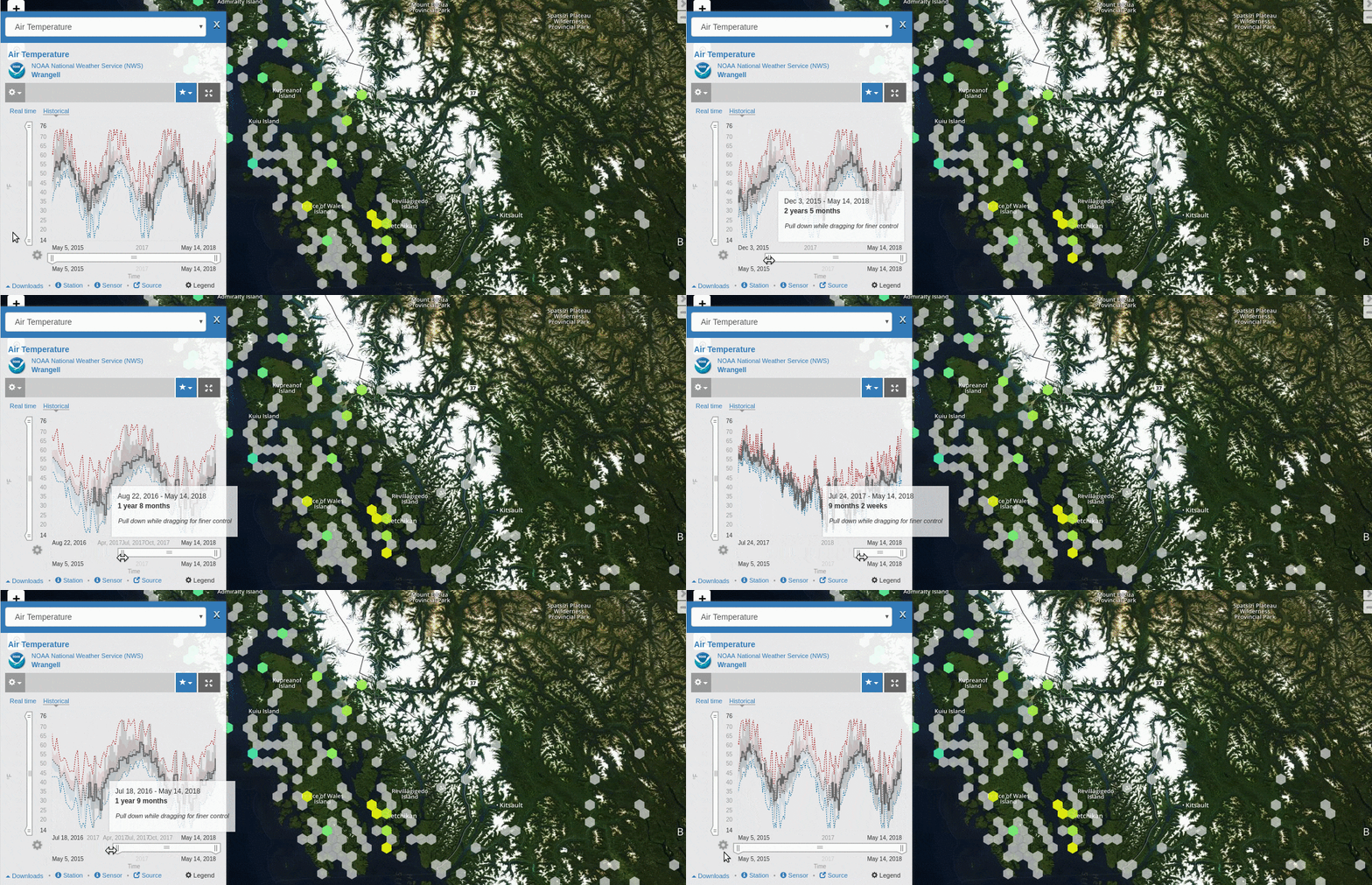
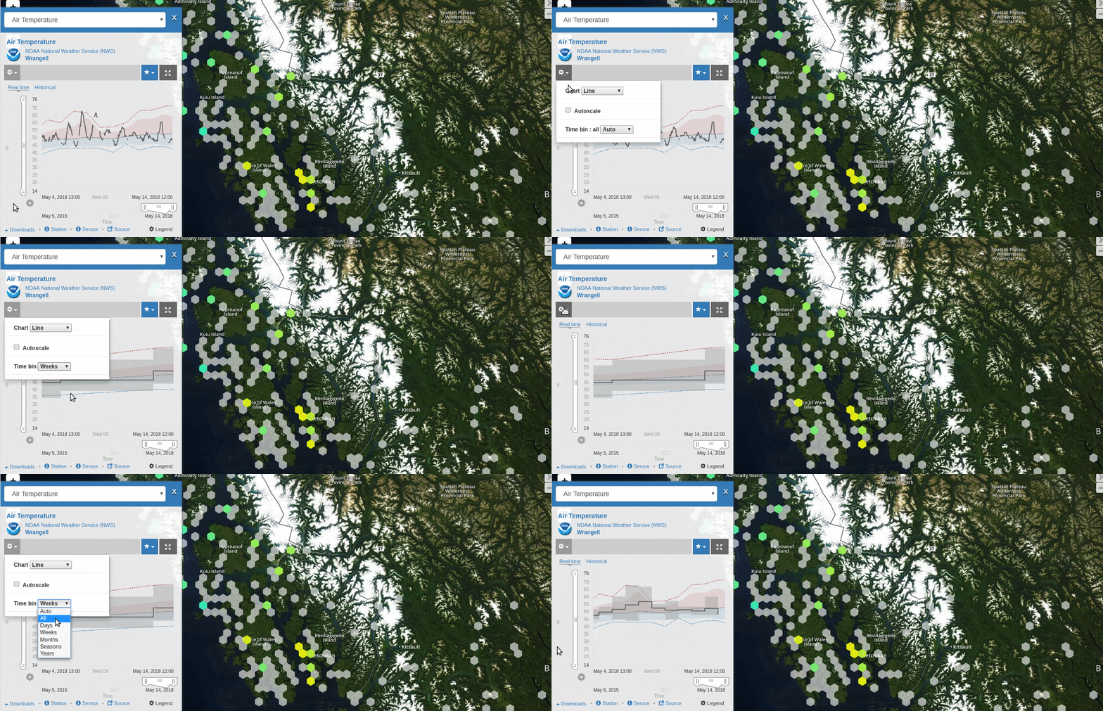
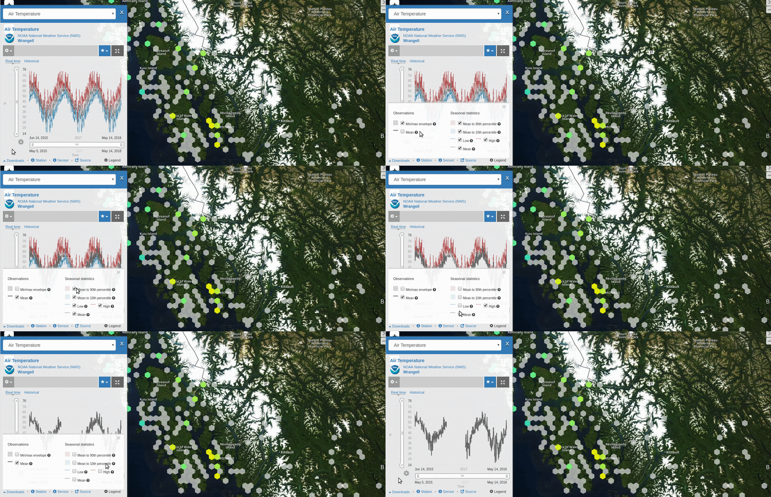
You can adjust the way data are displayed in the chart on the right-hand side of the window, including but not limited to the following:
Change the chart type.
Scale the Y-axis (data values)

Scale the X-axis (time)

Re-bin the data

Display min/max values and/or mean values

Display data quality flags (when available). Refer to Quality Flags (QARTOD) section.
Additionally, you can explore the selected data more in depth by viewing the station information ![]() , the sensor information
, the sensor information ![]() , the source information
, the source information ![]() , or downloading the data
, or downloading the data ![]() .
.
For more information, please see the Customize Data in the Map section.
For more information about charts, including definitions of many of the terms used here, please see the Data Charts section.